
What Is an Inverted Head and Shoulders Pattern? Nifty 50 Chart Example
Blog by Aliceblue News Desk
08 October 2026
10 minutes

A falling market does not turn upward all at once. It may drop, recover, make a lower low, and then stop falling before reaching that low again. Traders watch for this sequence because it can form an inverted head and shoulders pattern. The pattern is a possible sign that a downtrend is losing strength.
Quick Answer
An inverted head and shoulders pattern, also called an inverse head and shoulders pattern, has three lows. The middle low, called the head, is deeper than the left and right shoulders. A line joining the two highs between these lows is the neckline. If the price moves and closes above that line, traders may see it as a sign of a possible upward turn. The breakout can still fail.
Table of Contents
- What is an inverted head and shoulders pattern?
- How does the pattern form?
- What does the Nifty 50 chart show?
- How do traders assess a breakout?
- What are its benefits and risks?
- What mistakes should beginners avoid?
- How is it different from head and shoulders?
- Frequently asked questions
What Is an Inverted Head and Shoulders Pattern?
An inverted head and shoulders pattern is a shape that can appear on a price chart after a decline. It has three dips: a left shoulder, a lower middle dip called the head, and a right shoulder that stays above the head’s low.
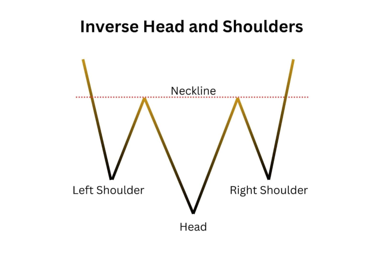
Here is why traders pay attention to it. At the head, sellers manage to push the price below the first dip. When the market falls again to form the right shoulder, it turns upward before reaching that lowest point. Sellers may be losing strength, though the three dips alone do not show that the decline has ended.
Traders then draw a neckline through the two highs between the dips. It marks an area where the price previously struggled to rise further. A move above the neckline is called a breakout. The neckline may be flat or sloped, as it is in the Nifty 50 chart below.
The pattern is one way to study price behaviour through technical analysis. It does not explain why the market moved or guarantee what it will do next.
How Does the Pattern Form?
- An earlier decline gives the pattern context. The market has been moving lower before the three dips develop.
- The left shoulder forms. Price falls to a low, then recovers.
- The head forms. Price falls below that first low before rising again.
- The right shoulder forms. The next decline stops above the head’s low.
- Price approaches the neckline. Traders check whether it can move past the line joining the two recovery highs.
- A breakout may follow. A close above the neckline is more meaningful than a brief move above it during trading hours, but it cannot rule out a later fall.investopedia+1
The shoulders do not have to sit at identical levels. Focus on the sequence: a low, a deeper low, a higher low, and a test of the neckline.
What Does the Nifty 50 Chart Show?
The supplied Nifty 50 daily chart shows an analyst’s inverted head and shoulders drawing across the period from 22 February to 27 April 2023. The left shoulder appears around late February, the head around mid-March, and the right shoulder around the second half of April. The neckline rises slightly across the two intervening highs. These are readings of the marked chart, not exact prices for each turning point.
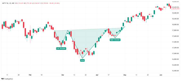
The picture makes the right shoulder easy to understand. After the deeper March low, the index fell again in April, but stopped well above that March low. It then climbed towards and past the sloping neckline shown on the chart. The candles to the right show that the index continued rising after the marked formation; they do not mean every inverted head and shoulders breakout will do the same.
Part of the pattern | Approximate location on the supplied chart | What to notice |
Left shoulder | Late February 2023, around the 17,200-point area | The first marked low, followed by a recovery. |
Head | Mid-March 2023, around the 16,800-point area | The deepest marked low. |
Right shoulder | Second half of April 2023, around the 17,500–17,600-point area | A dip that stays above the head. |
Neckline | A slightly rising line through the intervening highs | The area the index needs to cross. |
These rounded levels help readers follow the image; they are not exact daily closes or independently verified turning-point values. Because the neckline slopes, assigning one fixed neckline price to the whole pattern would be misleading.
What happened between 22 February and 27 April?
The Nifty 50 closed at 17,554.30 on 22 February 2023 and 17,915.05 on 27 April 2023. That is a rise of 360.75 index points, or about 2.1%, between those two closing dates. Both closing figures are reported in historical market coverage.
That calculation describes the index’s movement across the period. It is not the return from buying at the neckline, and it is not a trader’s profit. The neckline breakout shown in the chart occurs later than the 22 February starting date. An investor’s result would depend on when they traded, what instrument they used, and when they exited.
There is another reason to keep the units clear: Nifty 50 levels are index points, not rupees per share. The index chart can illustrate the pattern without the stock-split or bonus-adjustment issues that complicated the earlier company examples. It cannot, on its own, calculate the profit or loss on a Nifty futures, options, or fund position.
Chart-editing check: The image’s top-left OHLC readout shows a level around 22,720, while the plotted historical candles and right-hand scale are around 16,800–18,600. That readout does not match the displayed 2023 pattern. Remove or correct it in the publishable image rather than leaving readers with conflicting numbers.
How Do Traders Assess a Breakout?
Start with the close. The index can cross a neckline during a session and drop below it before trading ends. Some traders wait for a daily close above the line to check whether the move held through that session. It is still possible for the index to fall back on a later day.
Next, look at volume, or how much trading took place. More trading activity during a breakout can add support to the move. But a pattern, a close, and higher volume together are still evidence to weigh, not a promise of higher prices. The supplied chart does not display a volume panel, so this article should not claim that volume confirmed the Nifty 50 move.
Some traders wait for a retest. That means price crosses above the neckline, comes back towards it, and then rises again. It gives them another chance to judge whether the former ceiling is holding as a floor. A retest might not happen, and price can fall through the neckline instead.
Finally, decide what would prove your reading wrong. A fall back below the neckline or below the right shoulder may make a trader reconsider the setup. The exit level depends on the actual chart and the amount the trader can afford to lose; it should not be copied from someone else’s example. A stop-loss order can help carry out an exit plan, though it may execute at a different price during a sharp move.
How Is a Pattern Target Estimated?
One common method measures the vertical distance between the head’s low and the neckline, then adds that distance to the neckline at the breakout point. This produces an estimated chart level, not a guaranteed destination.
For a simple calculation, suppose a hypothetical index has its head at 16,800 points and a flat neckline at 17,800 points. The distance is 1,000 points, giving an estimated level of 18,800. This is only a teaching example. The neckline on the supplied Nifty 50 chart slopes, so those numbers should not be presented as its exact target.
What Are Its Benefits and Risks?
The main benefit is that the pattern gives traders a series of checks. Rather than deciding that a market “looks ready to recover”, they can ask: Was it falling first? Is the middle low the deepest? Did the right shoulder stop higher? Has the price crossed the neckline?
It also helps them think about an entry, an exit, and a possible price level to watch. The danger is a false breakout: price moves above the neckline, attracts buyers, and then falls back. A trader who bought too early, took too large a position or had no exit plan may lose more than expected.
There is no stop-loss distance that suits every chart. A nearby exit level may be reached by an ordinary short-term move; a farther one increases the possible loss per unit. Work out the money at risk before choosing position size.
What Mistakes Should Beginners Avoid?
- Seeing a pattern in every three dips. Check for an earlier decline and a middle low that is deeper than both shoulders.
- Buying before the neckline is crossed. The shape may form without a breakout.
- Drawing a convenient neckline. Join the two recovery highs; do not move the line just to make a trade look attractive.
- Using one price for a sloped neckline. Its level changes along the chart. Check it where the possible breakout occurs.
- Claiming volume confirmation without volume data. The supplied Nifty 50 image has no volume panel.
- Calling index points a trading profit. A 360.75-point change in the Nifty 50 is not ₹360.75 earned by an investor.
- Treating a target as certain. A pattern offers an estimate and an idea to test, not an assured outcome.
How Is It Different From Head and Shoulders?
The standard head and shoulders pattern has three highs and can suggest a turn down after a rise. The inverted version has three lows and can suggest a turn up after a decline. Both rely on what happens at their necklines.
Feature | Inverted head and shoulders | Head and shoulders |
Shape | Three lows; middle low is deepest | Three highs; middle high is highest |
Earlier trend | Usually falling | Usually rising |
Neckline move watched | Above the neckline | Below the neckline |
Possible signal | Turn upwards | Turn downwards |
Important caution | An upward breakout can fail | A downward break can fail |
The inverted pattern is most useful to someone who follows charts and can plan how to manage a position. A long-term investor may use it to understand recent market behaviour, but should not treat a chart shape as a substitute for deciding what to invest in and why.
Conclusion
An inverted head and shoulders pattern shows three lows, with the head below both shoulders. The neckline gives traders an area to watch for a possible upward breakout. Your Nifty 50 daily chart from February to April 2023 shows those parts on a familiar Indian index, without relying on old, adjusted stock prices. The chart is useful because the right shoulder and sloping neckline are visible, not because it proves the next pattern will succeed. Check the close, make no claims about volume without the data, and decide your risk before considering a trade.
Frequently Asked Questions
It is a possible bullish reversal pattern after a decline. Traders commonly watch for price to close above the neckline before considering it complete
It is the line drawn through the two highs between the three lows. It marks an area price previously struggled to cross and may slope upwards or downwards.
No. The two shoulders do not need identical lows. In an inverted head and shoulders pattern, the middle low should be deeper than both of them.
No. The price can close above the neckline and fall back on a later day. Traders call this a false breakout.
Measure from the head’s low to the neckline and add that distance to the neckline level at the breakout. The answer is an estimate, not an assured target.

Blog by Aliceblue News Desk


